Cook
Kennel Addict
- Joined
- Aug 15, 2014
- Messages
- 6,454
- Reaction score
- 6,045
Matters if it’s to be a future tattoo.But seriously, who cares about logos?

Matters if it’s to be a future tattoo.But seriously, who cares about logos?
100% this is the logo that a lot of us older supporters grew up with and even today really stands up there with best,and it’s from a time when we tasted success and opposition sides hated our guts.Our best logo ever and whenever we do modernize ours it’ll look closer to to this
View attachment 32087
The logo on the left looks mad indeed!These look mad
I hated this logo. I think our current one is the best we have had.My favourite logo
View attachment 32083
The constipated Bulldog. You can never see it in the same light again.My favourite logo
View attachment 32083
As a whole, I'm over the crappy 3 colours & 2D graphics that all teams use. I prefer the old NSWRL logos within a circle.our current logo is almost perfect... no need to change, especially since we really do not want to be in the company of or follow the lead of the likes of the Tigers and Titans
seriously, how do you get a titans logo wrong... gods that held up the world, the heavens, waged war... helm, sword, spear etc... and this is what the Gold Coast come up with -->
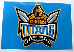
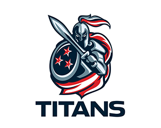
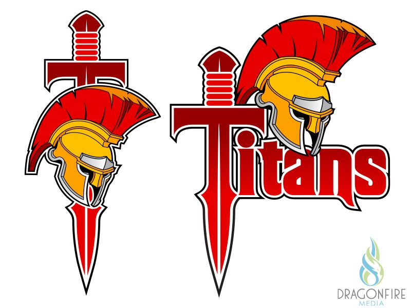
and compared to what others have come up with...


A lot called it the Pyscho Asian BulldogThe constipated Bulldog. You can never see it in the same light again.

The best logo the club has had! This is what the bulldog on the current logo needs to be updated to. Its got teeth, looks tough. The one we've got now looks like a sad little puppy. The only change i'd make to our current logo is swapping the dog to this dogView attachment 32159
Absolutely not.!!! but always loved the old retro logo.
IIRC we used that logo when called the Sydney Bulldogs for a year or two, that's one thing I don't like about it.That was an awful logo but they played well with it don’t mind the current logo but it just feels like it’s missing something maybe the words “Canterbury Bankstown” and I wish it had a darker shade of blue
yep this one is my Favorite logo!View attachment 32159
Absolutely not.!!! but always loved the old retro logo.
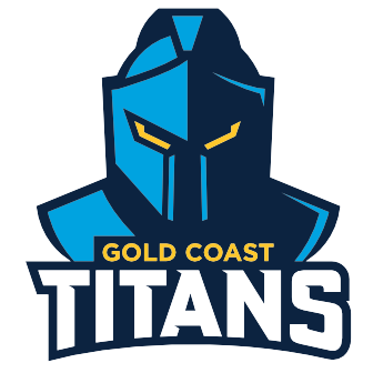
So far, the Tigers and Titans have changed their logo for 2022 onwards. Whilst I don’t think changing logos often is necessary, we’re clearly going into a new era.
In my opinion, we need to make it simpler, while also making the Bulldogs itself much more threatening.


