
- Joined
- Apr 24, 2018
- Messages
- 6,568
- Reaction score
- 3,446
Nothing has, or ever will be, worse then the Sydney bulldogs logo!!!!!!
the floating head? yuk

Nothing has, or ever will be, worse then the Sydney bulldogs logo!!!!!!
Especially after what they changed it from!! However I think the logo we have now is the best so far. So they did make amends!the floating head? yuk
Hahahahaha absolute twats.. !!!Did anyone watch the video? With Buderus, Harrigan etc?
They were the only two who could talk on behalf of the knights.
They had Klemmer and Pearce talking as if they are the the heart and souls of the team lmao.
I see this new logo change(s) introduced by the nrl with certain guidelines are to intentionally have teams branded without their location in the name... I reckon this will creep into sydney franchises as the nrl would love to have say Cronulla Sharks just branded 'Sharks' makes relocation that little bit easier over time. It's a weird way of looking at it, but I believe that's what the fuckers at HQ would be thinking aboutI hate the Knights, but I always thought they had a really nice logo.... this thing, this is fucked.... The original wordmark was a beautiful piece of typography... and this.... dull as hell...
View attachment 11401
Credit must go to us and Parramatta for keeping things as traditional as possible.
Also some teams like in the AFL like S. Kilda, Melbourne, Carlton and Collingwood.
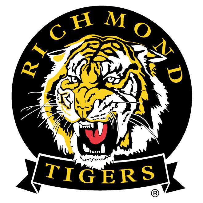
Even the Richmond Tigers had a bloody good logo before they changed it... it used to remind me of the Balmain Tigers logo!
Thought it was more like this....thar redneck loser look....I hate the Knights, but I always thought they had a really nice logo.... this thing, this is fucked.... The original wordmark was a beautiful piece of typography... and this.... dull as hell...
View attachment 11401
