berries1935
Kennel Enthusiast
- Joined
- Mar 30, 2017
- Messages
- 1,650
- Reaction score
- 2,615
These just dont feel like bulldogs jerseys.

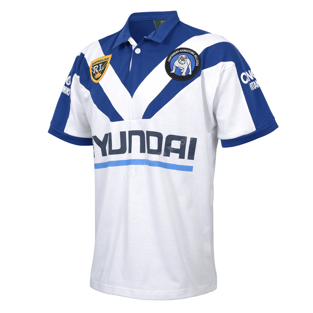
On special this weekend too.This is always my Favourite one.
 myteamshop.com.au
Me too.View attachment 95697This is always my Favourite one.View attachment 95697
I'm happy to change with the timesThese just dont feel like bulldogs jerseys.
I don't mind the new jersey's, I can see what some might say about the chevron, double v but I sort of prefer the 2024 style so the sponsor doesn't "white out" the chevron(V's).I thought the clown krew were negative, then I read this thread. Fmd anyone would think it’s a garbage bag. Must be some nostalgia or something clouding peoples’ memories of older jerseys because these new ones are way better than most of those. Clean, blue and white designs. No other colours (unless on the back) and nothing ugly about them. I’ve had many and seen the rest and there’s no way you can seriously tell me there’s been better than the 2024 versions. Super league? Nope. 80s, good but not quite. 90s, haha no. last year’s indigenous one is the only challenger and it’s obviously very different to our standard design.
The Gazelle.Who’s the guy on the far left?
No idea why they dont continue the V upto the shoulders.Would it hurt to add more blue to the home jersey?
Honestly looks like a half done stencil.
I agree with that but I think it’s the way the modern jerseys are constructed that would make it look weird, because you’d be continuing the V over the seam.No idea why they dont continue the V upto the shoulders.
Such a simple thing that makes the jersey look like unfinished.
So they just got 4 players kitted up in some fakes to throw everyone off the huge reveal coming later? HahaI honestly don’t think these are our jerseys. Think there is something new coming
I’m with u bud, clubs doing a great job.Been watching them since 1979 and never ever seen them wearing a dud jersey. I love the blue and white. Another fantastic effort and design this year! Can’t wait to see them run out!
You fucker!The Gazelle.
 shop.bulldogs.com.au
StfuDo they double and triple check photos before making it official?
They could of told Knight to roll his left sleeve all the way out
Suck my dick you dirty MF cűñtStfu
i agree, i feel the colours would suit better if the shirt and shorts matchedI hate the white shorts with the away jersey.
Hate it.
It looks horrible.
We look more like the Newtown Jets than the Newtown Jets do.i agree, i feel the colours would suit better if the shirt and shorts matched