
- Joined
- Apr 24, 2018
- Messages
- 6,568
- Reaction score
- 3,445
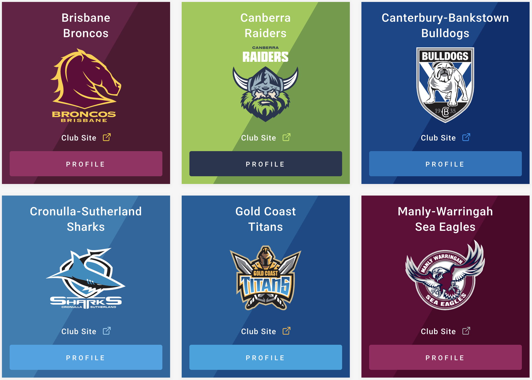
Having viewed the @Wahesh Old NSWRL logos post, I am interested in getting TK thoughts on the current logos of the various teams in the NRL. Which teams do you think have the best logos, and which teams have the worst? 2-3 for each, but we will leave the Doggies out, because we already know we have the best logo in the NRL.
My best:
Manly - Always been drawn to their logo, that's a great looking bird and just an all round quality piece of design
Raiders - really nice refresh of the logo, viking looks awesome, the teal blue contrast with the lime green is a nice touch, and the new wordmark is a huge improvement
My Worst:
Titans - Hands down the worst logo in the comp... not sure how anybody would fair on the battlefield with swords that large.. ugly colours.. looks like something you'd see on Twitch
Sharks - flimsy looking Shark, overkill with the white, and the typography is all over the place


