2ndphase
Kennel Addict
- Joined
- Jan 29, 2016
- Messages
- 5,294
- Reaction score
- 13,469

Last edited:

I dunno why we just don’t wear this full time . It’s 18373 times better then classics design which is so shit
Holy crap that good.
I like it, although I think the Laundy logo kind of interrupts the V, personally I would have had it higher or lower . . . In saying that, keep stumping up the cash and you can put the logo where you like !
Say what you like, nothing looks better than that blue V on the white jersey . . . Bad news for me though, it's a pain to get Sauce and mustard offOk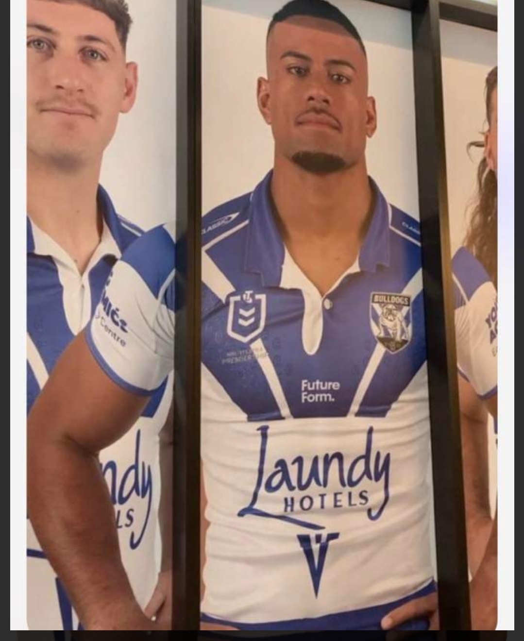
Sent from my SM-S918B using Tapatalk
The jersey is the jersey, only players can embarrass itNice. Another jersey we can disgrace lol jokes looks good.
Fuck that’s sexyOk
Sent from my SM-S918B using Tapatalk

