- Joined
- Apr 24, 2018
- Messages
- 6,568
- Reaction score
- 3,445
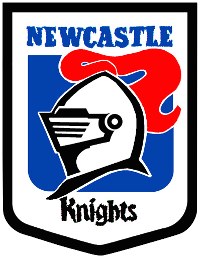
I hate the Knights, but I always thought they had a really nice logo.... this thing, this is fucked.... The original wordmark was a beautiful piece of typography... and this.... dull as hell...


Looks like a red dildo on topI hate the Knights, but I always thought they had a really nice logo.... this thing, this is fucked.... The original wordmark was a beautiful piece of typography... and this.... dull as hell...
View attachment 11401
It's a sad state of affairs.. I go to Newcastle quite a bit so I'm always passing their logo in Broadmeadow.. it was right on the mark, the look, the feel, everything.. now it just looks corporate... I mean I'm not against the minimalist trend, but it's rugby league ffs, needs characterJust had to google the old one which is much better. I've never really judged their old logo, but it's actually pretty intelligently designed. No idea why they're switching to a cheap looking design when they probably have one of the most artistic ones left in the comp.
It's the sad way our game is going brother. They are moving to American type logos - 2-3 colours and 2d graphics - as opposed to the traditional crest and animals we used to use around here.It's a sad state of affairs.. I go to Newcastle quite a bit so I'm always passing their logo in Broadmeadow.. it was right on the mark, the look, the feel, everything.. now it just looks corporate... I mean I'm not against the minimalist trend, but it's rugby league ffs, needs character
Every logo across every industry is moving to simplify their logo, not just NRL.It's the sad way our game is going brother. They are moving to American type logos - 2-3 colours and 2d graphics - as opposed to the traditional crest and animals we used to use around here.
Look at the most recent entrants to the comp still in it today - Knights, Warriors, Broncos, Cowboys, Storm, Raiders, Titans... they are mascots you associate with American sports teams, not ours.
Credit must go to us and Parramatta for keeping things as traditional as possible.Every logo across every industry is moving to simplify their logo, not just NRL.
But agree with the americanisation generally, fuck that shit
hahaha good man.I just hate the knights lol.. Logo or not!!
Credit must go to us and Parramatta for keeping things as traditional as possible.
Also some teams like in the AFL like S. Kilda, Melbourne, Carlton and Collingwood.
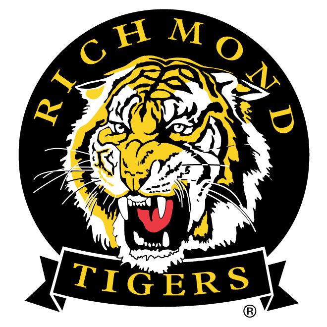
Even the Richmond Tigers had a bloody good logo before they changed it... it used to remind me of the Balmain Tigers logo!
OkI'd be happy if we reverted to our Berries logo.
Simple, timeless and classic.
Nothing has, or ever will be, worse then the Sydney bulldogs logo!!!!!!I hate the Knights, but I always thought they had a really nice logo.... this thing, this is fucked.... The original wordmark was a beautiful piece of typography... and this.... dull as hell...
View attachment 11401